 Originally published on January 21, 2013 by Daniel Zobel
Last updated on January 29, 2024
•
22 minute read
Creating software that is powerful AND easy to use has always been a driving concept here at Paessler. The key component is a great user interface that is easy to understand, displays exactly the right amount of information and is so much fun to use that you don't even notice the UI itself, yet you are able to easily make full use of all the power it puts at your fingertips.
In our continuous rollout strategy to constantly improve the PRTG software and add more features, we have directed our most recent attention on the user interface, with improvements to the web-based UI and also the Enterprise Console with it.
Note: The changes to the latest version of PRTG that are introduced in this article are currently available in the Canary channel (see details below: Beta Test the New Interface Now!).
Reinventing Interfaces
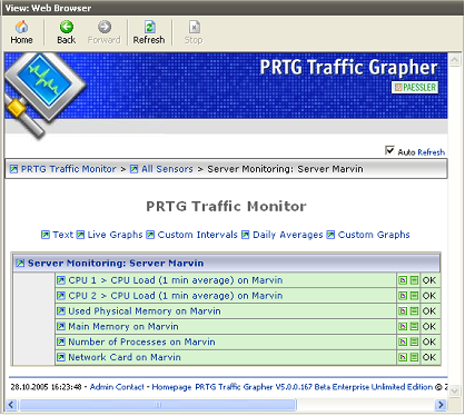
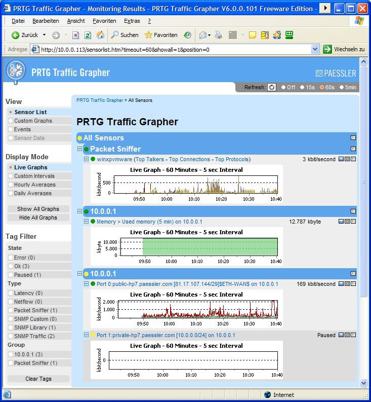
More than ten years ago, we began with rather simple functionality in PRTG Traffic Grapher and a very simple interface. Since then, PRTG has evolved. On the way to PRTG 12 we added more functionality, more sensor types, and many more options to use your monitoring data (PRTG Maps, geographical maps, historic data reports, sensor comparison lists, etc.). To minimize complexity and improve ease of use, we constantly reinvented the web interface to match the state-of-the-art system.

From PRTG version 1 through 6, the web interface was still just an addition to the Windows GUI and could only be used to get monitoring results in a web browser - the configuration could not be altered.
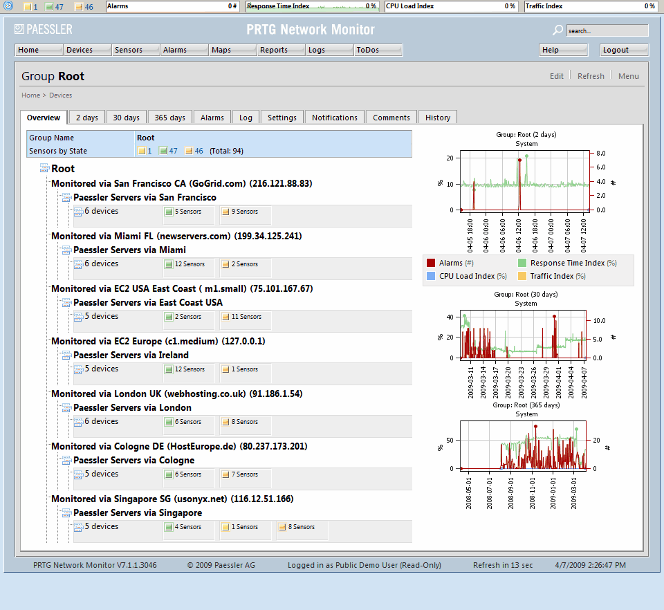
With the major rewrite for PRTG Network Monitor version 7, we built a much more powerful web server with the web interface becoming the central managing console including all functionality for monitoring setup and daily use. We were one of the first to make extensive use of the then-emerging "Asynchronous JavaScript and XML" (or AJAX), giving us the first browser-based applications that felt like exciting apps - not boring web pages. The early versions of GoogleMail were THE poster child AJAX project in the Internet at that time.
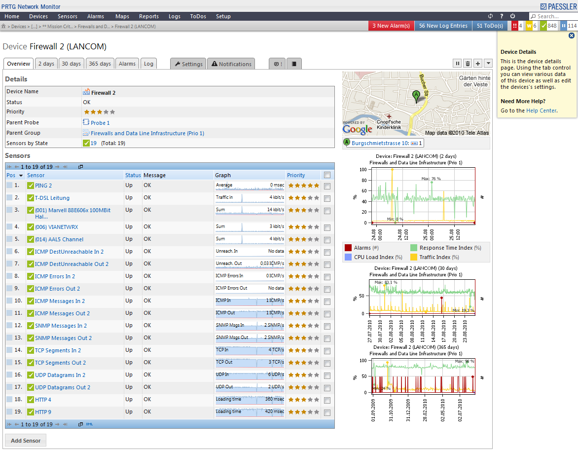
Over the years we received a lot of user feedback. We took it, aligned it with our own ideas and further developed the capabilities of the interface. For example, we added drag & drop functionalities in many areas. There were several redesigns along the way, too, that made your work faster and the displayed information easier to understand.
A Single Page Application

However, we continued to be frustrated by the load times of the single pages in the web interface. Although we kept improving the overall performance of the interface and the web server with many little tweaks and big changes, we were still unsatisfied with the overall experience.
That's why, on the way to PRTG v13 we decided to completely rewrite the existing code, changing the web interface to a Single Page Application (SPA), the latest generation of the AJAX concept.
We all use SPA apps every day. Services such as Gmail, Facebook, Twitter - even Google's search page - are not loading new URLs into the browser while you use them. Everything is basically kept in one browser window, with only certain areas refreshing as necessary. You will rarely see a full page refresh - as this would create a heavy performance toll due to the redundant processing of CSS, HTML and JavaScript code. Developers avoid this reprocessing with SPA, which speeds up the user experience.
PRTG now works the same way: the web interface will rarely load complete pages any more, but instead only single page elements will be refreshed when necessary. All object setting dialogues are now shown as pop-up layers, so you never lose the current context when changing the tag of an object or adding a notification trigger.
On top of this, we smoothed many little edges, so the interface is now both prettier and more intuitive to use. And, we now display more information on some pages while using less screen space to do so.
All this results in a much faster and simply better interface - and all of our users will profit from it! Everyday tasks can be done more fluently, and information is easier to access and more pleasing to the eye. We were even able to eliminate an entire settings tab from the sensor pages by integrating the sensor channels into the sensor overview page.
The Changes in Detail
More intuitive data display for
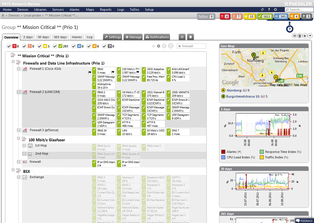
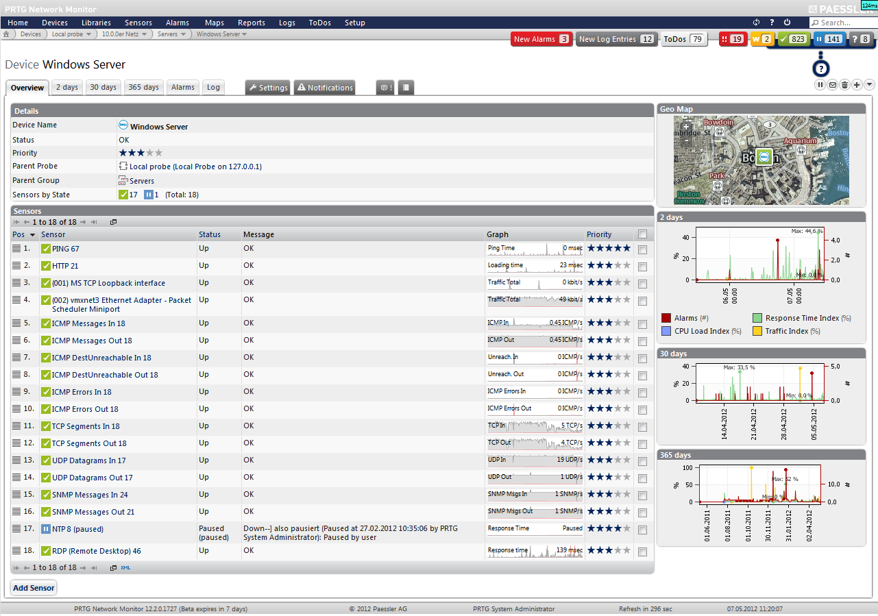
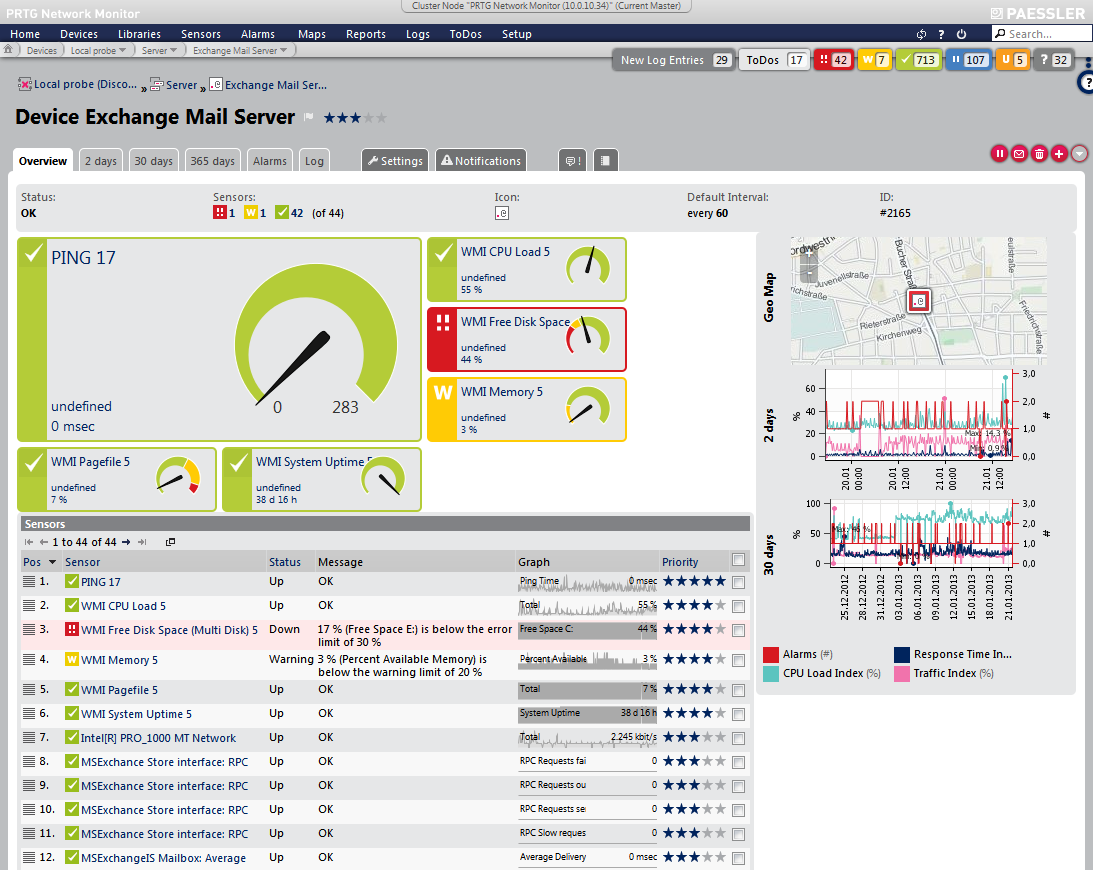
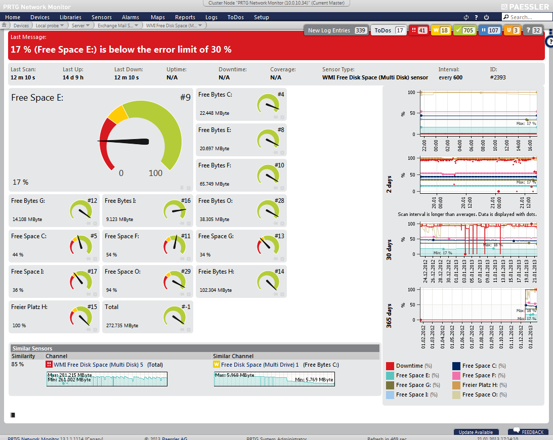
- Sensors: The most obvious change is the sensor overview page. Where users once saw mainly tables of text and numbers, they now see vibrant colored gauges showing the latest live data. The different sensor channels are more distinctive, and their settings can be changed directly at any time by clicking the gear icon. The sensor status is now shown with a full-width colored bar indicating the current status, so the user can see immediately whenever something does not work as expected.
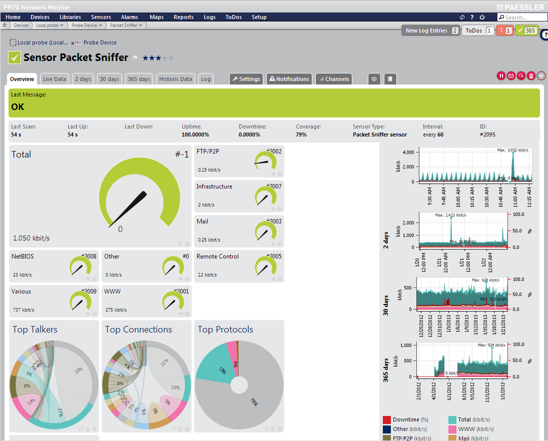
- Toplists of NetFlow, sFlow, jFlow and packet sniffer sensors: If a sensor provides Toplists (e.g. for flows and sniffing) we now display the Toplist graph right on the sensor page, which makes this feature much more useful, easier to find, and prominent.
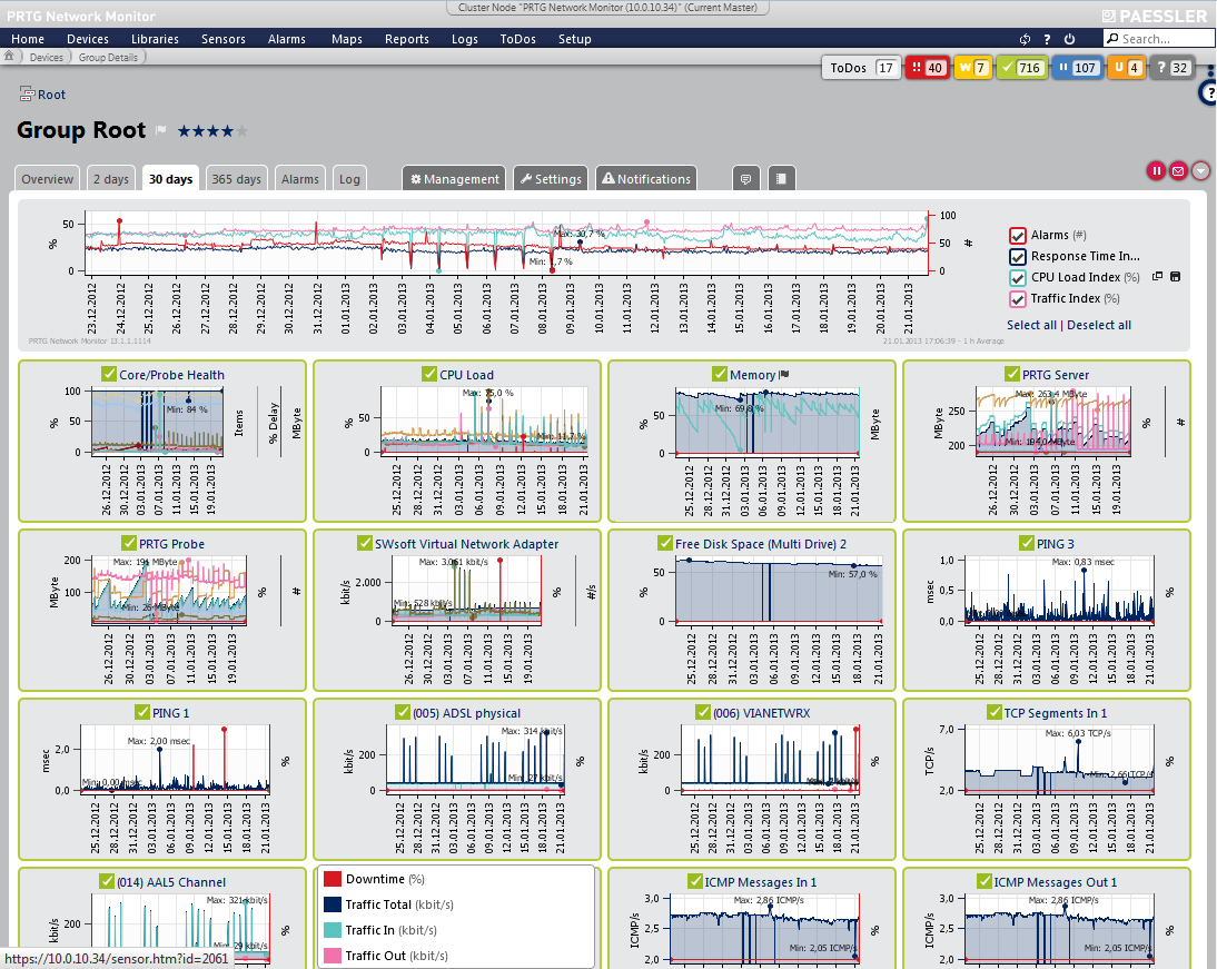
- Devices: Similar to the sensor page, we also changed the appearance of the device overview pages. They now show the sensors of a device in different sizes.
- Graphs: We changed the graph colors, making them easier to distinguish and fit better to the status colors.
Detect relationships between network components: There is new a heuristic calculation showing "similar sensors." PRTG goes through its monitoring database every day and finds sensors that show similar behavior. This analysis is completely automated and sensor type agnostic, based on math and fuzzy logic. We have already seen amazing correlations in our lab network that we did not expect. This feature helps users find interconnections in the network, for example, traffic peaks on the switch on the bookkeepers' floor whenever the CPU load of the server for the monthly payment reports goes up; or port X on router A has similar bandwidth consumption compared to port Y on server B, and the admin wasn't aware of a connection at all, etc.
See what is important to you: In PRTG, users can define priorities and favorites, sort lists accordingly, or show lists of favorites. We've now elevated those options to the next level. Now, you can change the priority and favorite status of devices and sensors at any time using the prominent star symbols or the flag symbols (for example, in the device tree), and PRTG uses the priority and favorite status of sensors to determine the display order and relative size of each sensor's appearance on the overview page of a device. We think you should decide what is important for you, and now we give you the option to display this information as you wish.
Stay in your workflow: All dialogues are now rendered as popup layers, so you never lose the context of what you're doing, even if you have to enter some additional masks with the user interface. Once you're done, you will be right back at where you've started.
The Downside: All Customizations Must be Redone
As of PRTG 7, the web interface has remained highly customizable. This means our users could always add their own CSS code or images, change colors, etc. They could even re-brand the interface to truly make it their own!
This kind of customization will still be available with the revised PRTG web interface. However, since nearly all of the code has been changed, existing customizations will not be automatically ported over to the new web interface. Custom code *might* work when simply copied to the directory of the new web interface, but it will likely need additional adjustment.
Usually, we try to avoid situations where customizations get lost with an update of PRTG. But this time, we had to weigh the advantages of this major upgrade against the effort required to adapt customizations. We think this new interface is well worth the one-time effort to check your adaptations, in order to profit from the new clean code of the web interface. In the end, the new architecture will allow us to make more and faster progress for upcoming versions and features.
And, in true Paessler style of making things as simple as possible, the new API documentation will include details on how you can customize the new web interface, to make it easier for you to view and use PRTG exactly as you wish.
For detailed information about customizations, please see our Knowledge Base article: What about my web interface customizations as of PRTG 13.2?
Test The New Interface Now!
The new interface is now available in the stable channel of PRTG. Get your free trial version now!
Please feel free to send us any feedback by contacting our support team. We would be happy to hear from you!


