 Originally published on April 01, 2013 by Gerald Schoch
Last updated on July 06, 2022
•
10 minute read
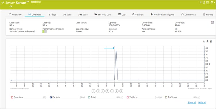
Spikes in your graphs can interfere with the reporting of a sensor. For example, a user told us that one of his sensors was reporting spikes of 10 GB/s traffic. Normally he would be fine with that, but this amount of traffic was reported for a 2 GB/s connection only.
Although such things happen only occasionally, they can still be annoying. In this blog post we would like to offer a solution for you in case you would like to remove spikes from your graphs.
If you are certain that the spike is out of the possible value range, you can use a spike filter to adjust the graph. Sometimes, sensors report enormously high or far too low values; due to an error in data transmission, or due to incompatibilities of the physical device you are monitoring. This is not a PRTG-related issue but is caused by the devices themselves. However, this can make the interesting values in graphs hard to read. To face these issues, there are two settings you should know of: "Spike Filter" and "Manual Axis Scaling".
What Is A Spike and Why Do I Need a Filter?
If you encounter spikes in your graphs, it’s of course necessary to investigate their cause. For example, you should check if they appear roughly at the same intervals or at the same time of each day. Check if there are any correlations to other sensors. Once you find a pattern, try finding other monitoring entries on the monitored system that match these patterns. Just make sure that the spikes are not truly reported values and can really be filtered out.
And you should know that reported values will not be deleted; they will only be hidden and can be displayed again if needed.
A spike filter, when enabled, disregards values above and below a certain limit in the monitoring data shown in graphs and tables.
Please note: The monitoring data itself will not be changed but only the presentation of the data. Furthermore, this setting is valid for all data of the selected channel, including historic data. This enables you to go back every time and check if such spikes occur in a regular manner.
Settings in PRTG to Remove Spikes
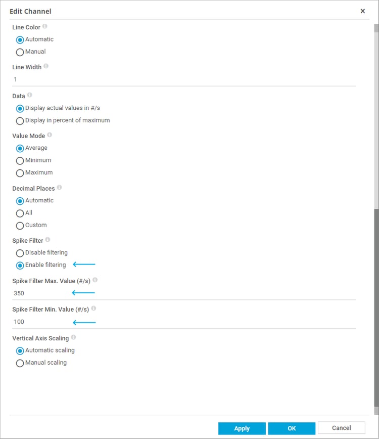
You can enable the spike filter in the channel settings. Each filter is valid for the selected channel only.
You can choose between:
- Disable Filtering: Display all data as it is; do not filter out spikes.
- Enable Filtering: Enable a filter to remove spike values. Additional fields appear below.
- Enter a number into the field Spike Filter Max. Value. Values above this value will be disregarded.
- Enter a number into the field Spike Filter Min. Value. Values below this value will be disregarded.
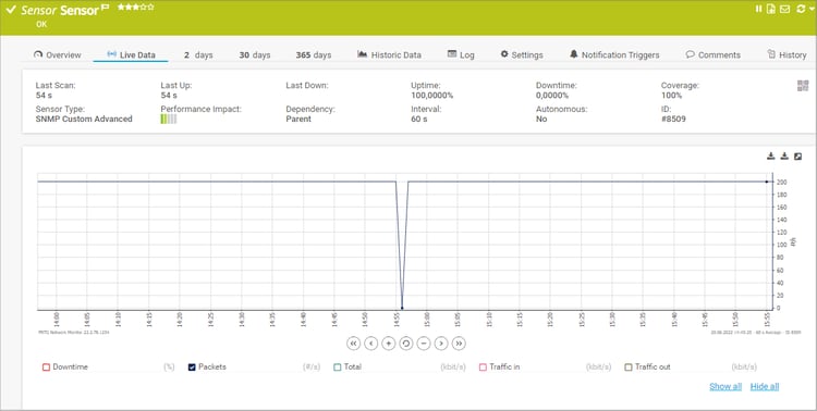
The resulting graph of these settings looks like this:
Making Your Graph Look Nice - Adjust Vertical Axis Scaling
Filtered spikes can scale the vertical axis of a graph out of range, because filtered values are displayed as “0”. For better visibility of the graph, you can preset the default value range. This is especially useful if channels return very high values.
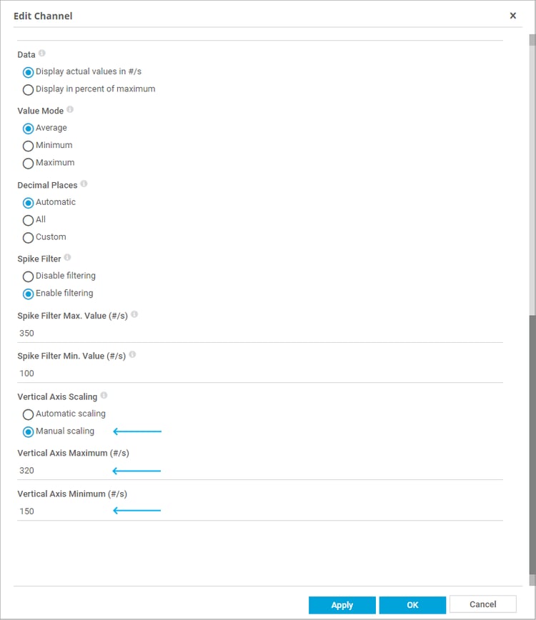
In PRTG, it’s possible to define how the vertical axis for the channel is displayed in graphs. You can choose between:
- "Automatic scaling": PRTG scales automatically, usually ranging from the minimum to the maximum value. PRTG will use one single scale for each unit label only.
- "Manual scaling": Define the scaling manually. Additional fields appear below where you can enter maximum and minimum values for scaling. Defining manual axis scaling can make common values better visible in your graph, but it may result in a chart with multiple vertical axes for the same unit label.

You can see that the removed spike is no longer affecting the graph because the vertical axis was adjusted. You can now analyze the resulting data in a better way, because the common values of this channel are displayed in more detail.
Further information
- Knowledge base: Why do I see huge peaks or spikes in graphs for SNMP sensors?
- Knowledge base: How can I delete some bad data?