 Originally published on September 01, 2010 by Daniel Zobel
Last updated on March 03, 2022
•
10 minute read
While the beta test of PRTG 8 is running we are posting a series of blog articles about new features! In the last blog entries, a lot of new features have already been introduced. To give you an extensive insight into the new Ajax web interface, we've compiled a series of screenshots so you can directly dive into the new look & feel of PRTG.
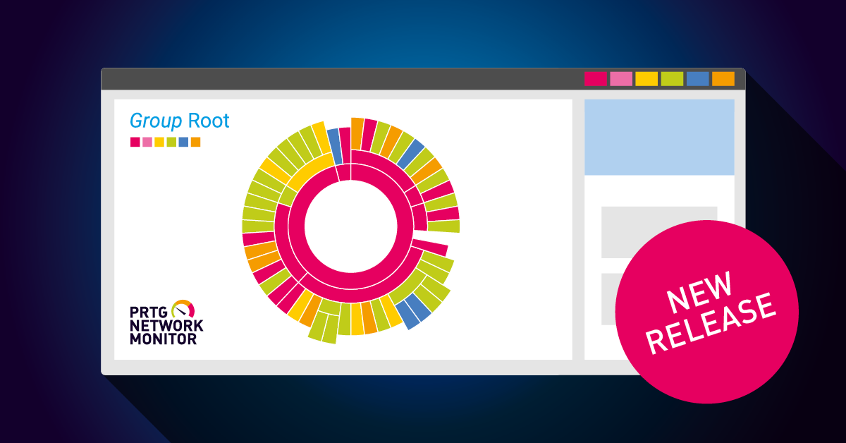
Devices Tree View
The tree view lists all of your devices in hierarchical order. Here, the Root group is shown with groups and devices, and the sensors for the devices. On the right side, summary charts for monitoring data are shown, as well as a geographical map indicating the location for every device. 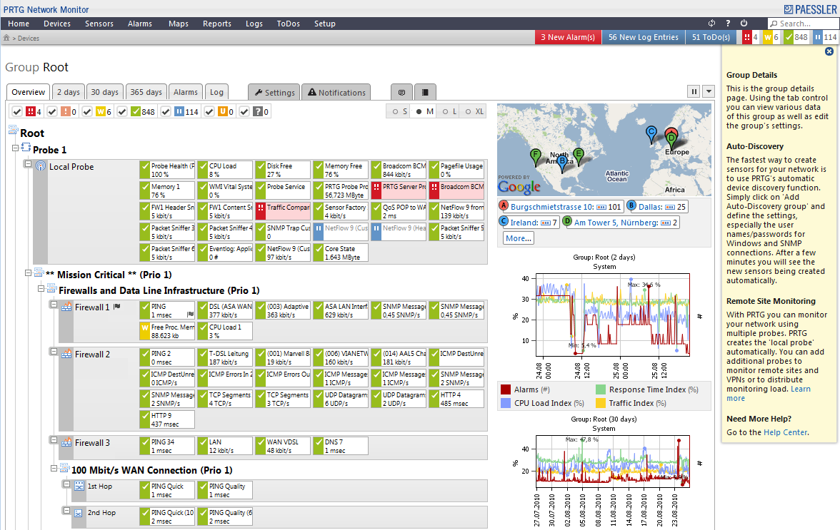
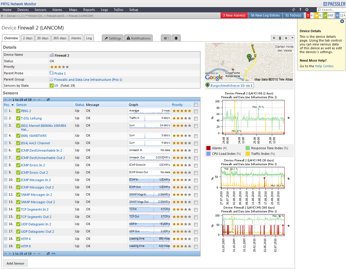
Device Detail View
The detail view of a device lists all sensors, monitoring different aspects, such as Ping, different protocols, and ports with status and mini-graphs. Here, a hardware firewall is shown. On the right side, summary charts for monitoring data are shown, as well as a geographical map indicating the location of the device.
Detailed Graph
Detailed graphs visualize your monitoring data. Here, a graph for a Ping sensor is shown. Every line shows one channel of the sensor, such as downtime, minimum and maximum response time, and average Ping time, and Packet Loss in percent. 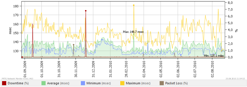
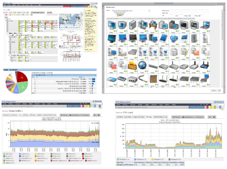
Toplists Show Bandwidth Usage
NetFlow, sFlow, and Packet Sniffing sensors support customizable toplists. They show the bandwidth usage by IP address, protocol, etc. Here, a toplist of the Top Talkers for a time span in August is shown. The chart shows the bandwidth usage by IP in percent. 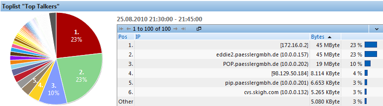
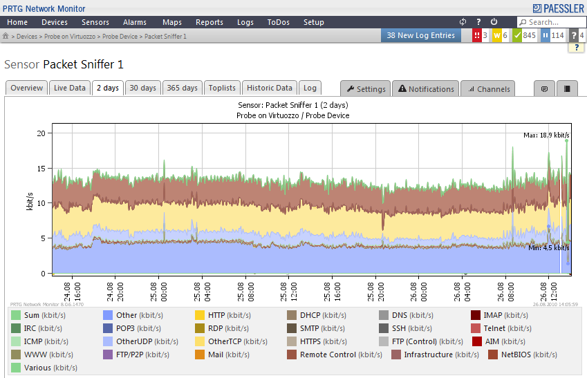
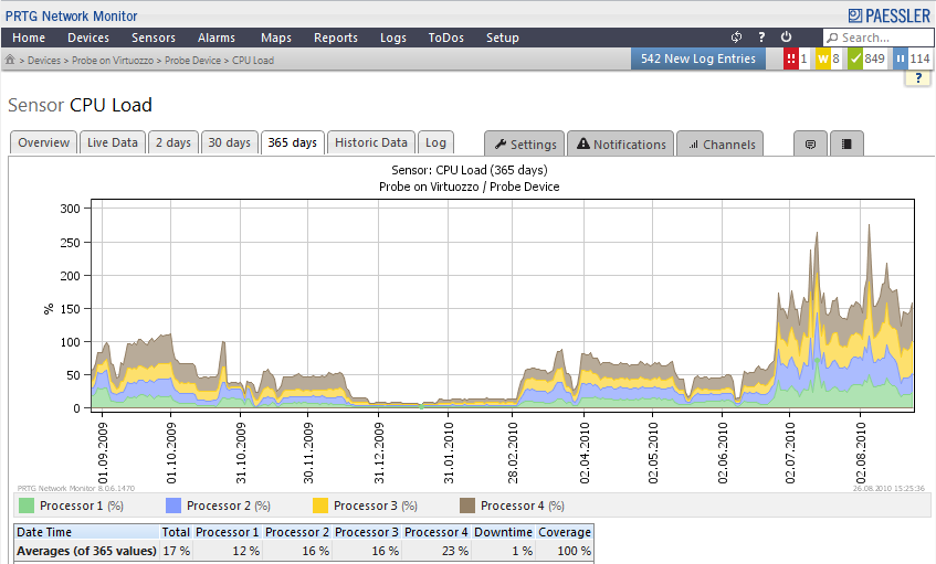
Stacked Graphs
Stacked Graphs visualize the components of the total bandwidth usage. The screenshots below show:
- Packet Sniffer graph, with traffic split into different protocols.
- The traffic of Paessler's fiber optic connection. Traffic in and out are split at the x-axis, showing traffic out mirrored to traffic in.
- CPU load graph. Each CPU's load is shown in one graph; the single stacked graphs show the CPU total usage.

Easy Sensor Setup
You can choose from over 80 different sensor types. You can choose a sensor by category, or simply search for a sensor type name. 
Alarms and Warnings Lists
The Alarms list shows all sensors that are currently in an Alarm or Warning status. It assists you to gain an overview of all problems in your network very quickly. The list shows the sensors' states, last value, message, and a mini-graph. 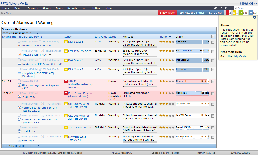
Create Own Maps
Using the Maps feature, you can create your own overviews of your network. Simply add objects from your setup, for example, icons, data tables, or graphs. You can make every Map publicly accessible, if you like.
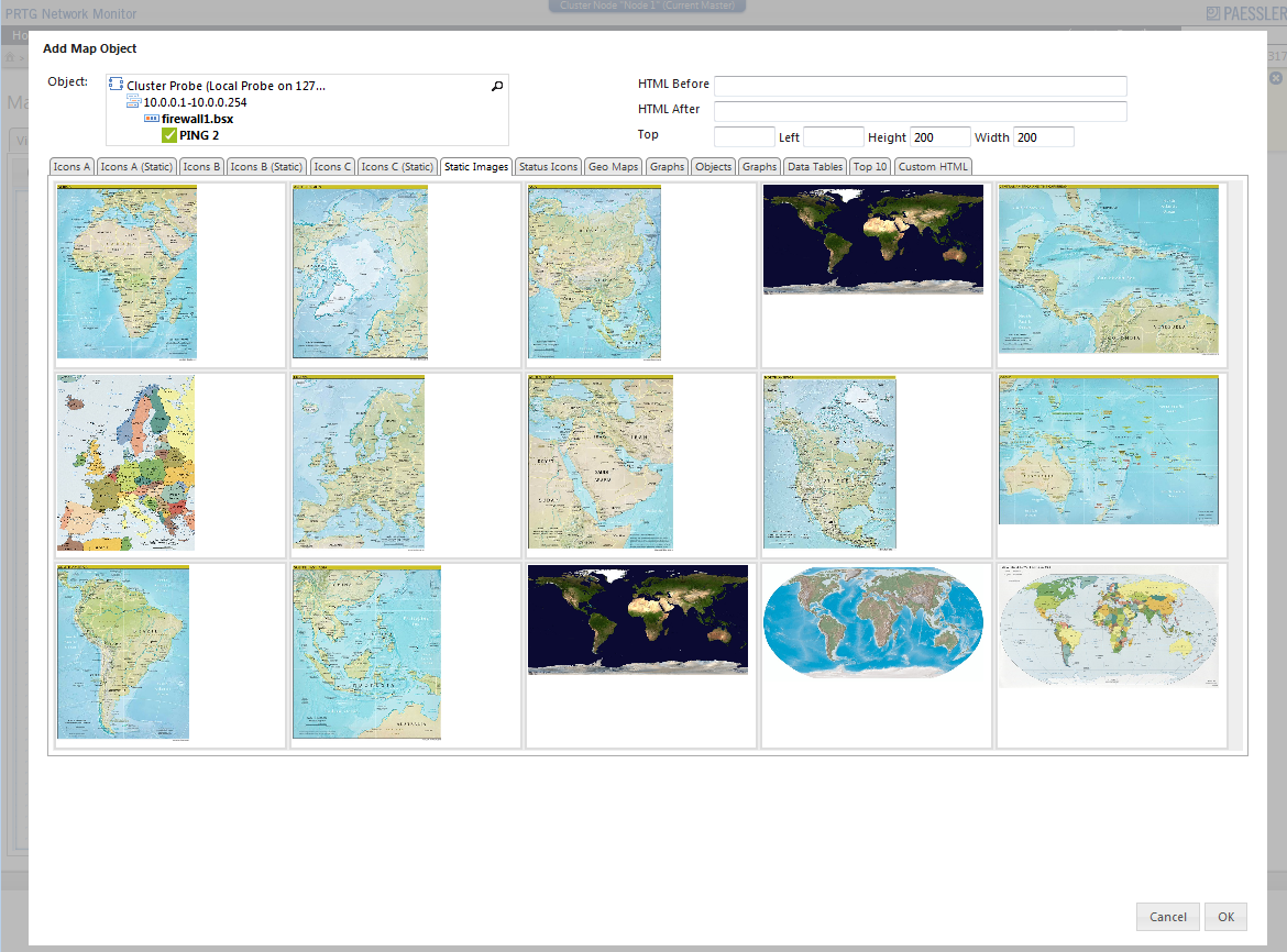
Create Own Maps—Add Objects
Adding new objects to your Map is easy: Simply select an appropriate icon from the list. You can also choose from geographical maps. Additionally, you can draw lines between objects to visualize network connections. 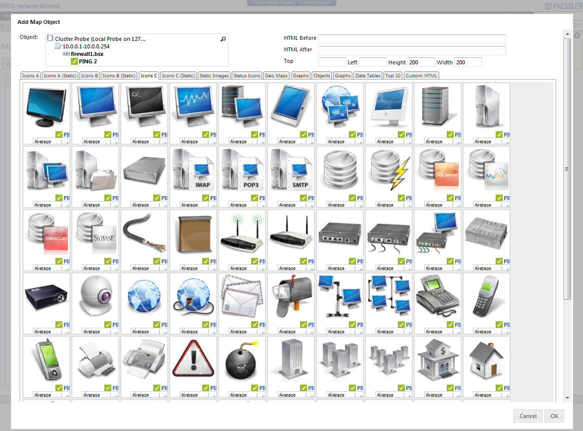
Cluster Status
Keep track of your cluster's status at any time. The Cluster Status page shows which nodes are connected to the cluster and if there are any connection or performance problems. 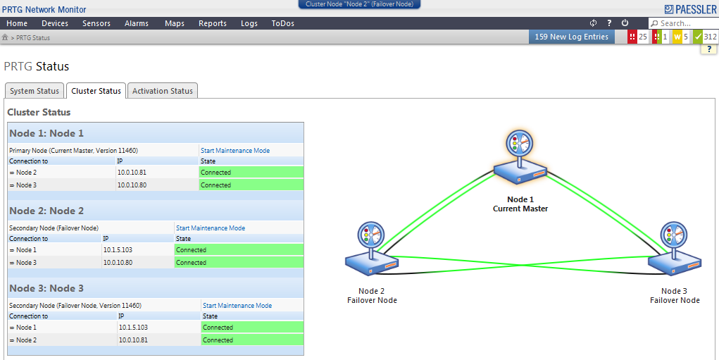
Beta Test it Today
Why not go and see for yourself? Download the latest Beta version today and have a look! All information can be found on the PRTG 8 Beta web page.