 Originally published on June 11, 2014 by Florian Staffort
Last updated on March 03, 2022
•
11 minute read
Although the "My PRTG Dashboard" competition is over, and three winners have been chosen, you shouldn't stop tweaking and improving your dashboards. Over the course of the last three months, we've seen about 30 great and inspiring dashboards—and while not every single entry in our competition could win, most of the entered dashboards follow the purpose of clearly displaying the most important parameters and numbers in an appealing graphical way for a very specific task and audience.
Let's have a look at the three runners-up, who were beaten only by a nose:
If One Dashboard Isn’t Enough…
Arnaud Chavet of Emerson Climate Technologies GmbH hasn't entered the classic global overview on a single dashboard, but several maps with relevant data from their IT infrastructure. Wow, that's a lot of data! To present the information highly visible to all the operators in the IT support offices, Arnaud and his team have installed an LED projector, which displays a Firefox session with all dashboards in different tabs, and an add-on that is automatically switching between the different tabs every 10 seconds. Pretty amazing—and an absolute necessity if you want to display that much data.
Many sensors used in the dashboards also have triggers and are generating e-mails or text messages. Besides presenting the state of tasks to perform on a daily, weekly, monthly and quarterly basis, the dashboards show a huge variety of monitoring data. Here are a few examples:
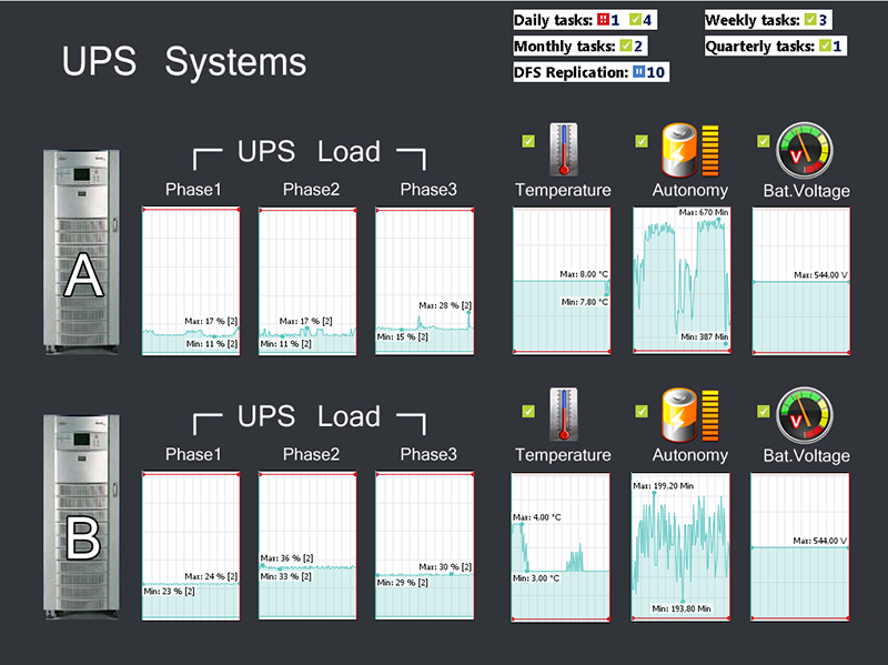
- UPS (Uninterruptible Power Supply) system monitoring via SNMP
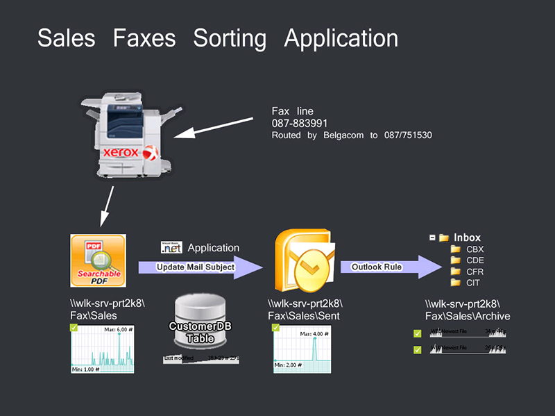
- Monitoring of incoming faxes including PDF conversion process via WMI
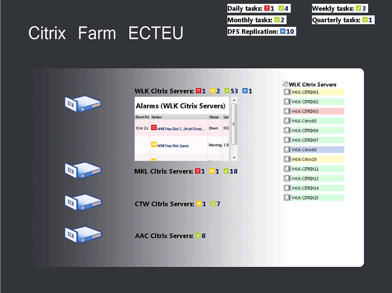
- Citrix farm state monitoring by zone via WMI
- Connection monitoring on Citrix servers to identify non-responsive server via WMI
- Monitoring temperatures in different rooms via SNMP
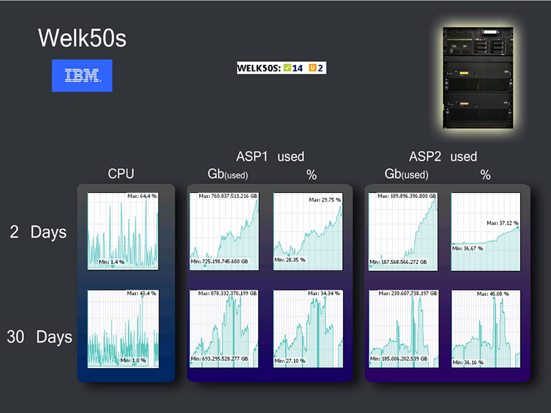
- CPU and memory monitoring of IBM iSeries system via SNMP
Visualizing Complex Infrastructures
Similar to Arnaud Chavet's dashboard also Rodrigo Arroyo of Grupo Expansión in Mexico has incorporated several dashboards in order to monitor their complex infrastructure. In the first column they show the course of their internet traffic through two redundant internet circuits as well as temperature values from their main data centers.
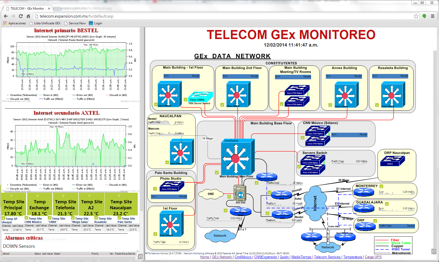
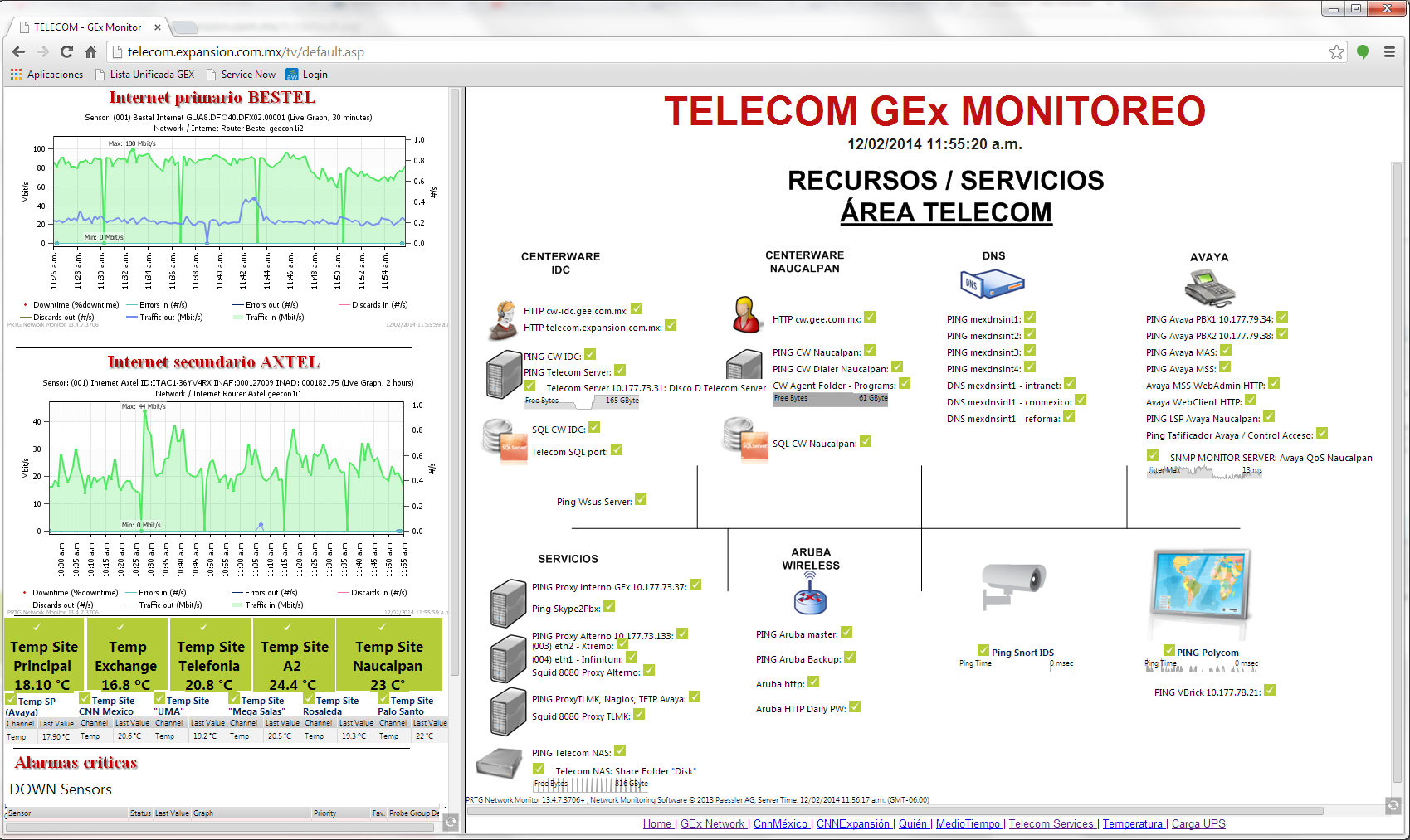
In the main area of the dashboard a total of eight maps is displayed, each of them for 10 seconds before the next map is automatically loaded. So for each website in their network, they are able to show the relevant status information of their servers, DHCP (Dynamic Host Configuration Protocol) or VoIP (Voice over Internet Protocol). Other rotating dashboards, for example, display monitoring data of the internal telecom service with HTTP (Hypertext Transfer Protocol), Pink, DNS (Domain Name System) and Jitter information, or a detailed overview of the UPS infrastructure with specific limits that trigger alerts when the UPS load is too high.
Preparing Specific Data for Customers
Erick Gomes of Adtech Telecom in Brazil provided us with a dashboard that enables their customers to follow and understand what is happening in their network in real-time. The dashboard was customized to simplify data organization by allowing Erick's team to enter data and redirect account specific information to their customers. It also helps them to gain agility in analyzing and solving alarms.
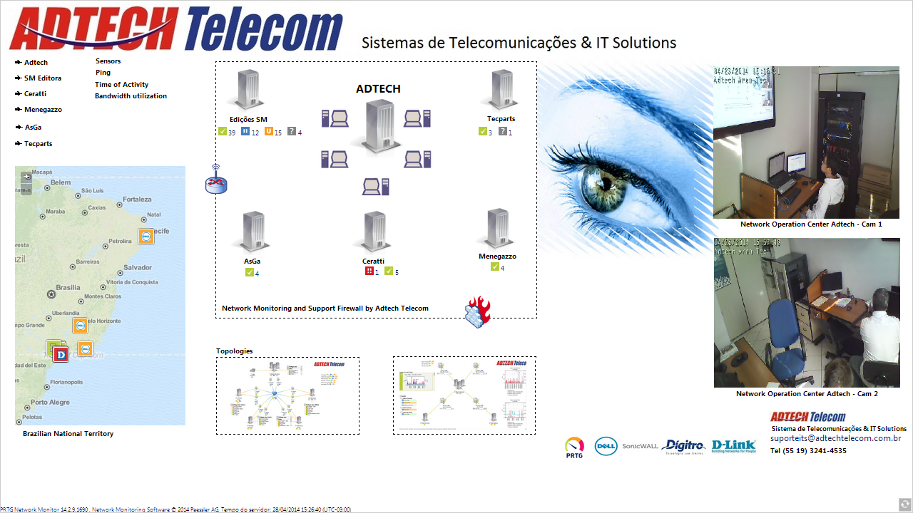
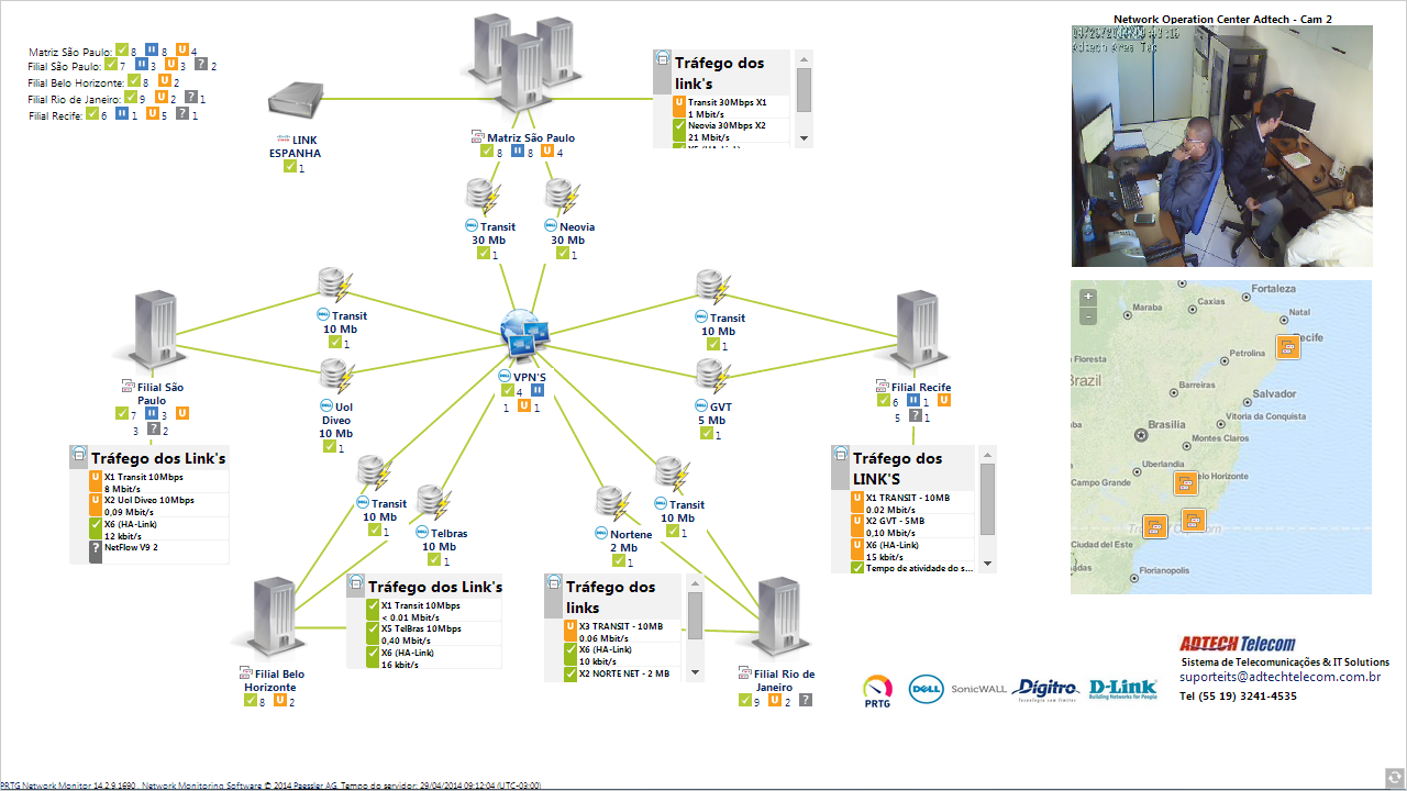
The possibility of displaying data in such an appealing and transparent fashion is a great way for the IT team at Adtech Telecom to demonstrate their work to their clients.
If you want to take a look at the winners of our campaign, just take a look at our "My PRTG Dashboard" winners gallery—also don't forget: Although the contest is over, we're still curious to see your dashboards-so don't be shy and share them with us via Facebook, Twitter or Google+!