 Originally published on June 04, 2014 by Florian Staffort
Last updated on September 05, 2022
•
9 minute read
After three exciting months the "My PRTG Dashboard" competition has come to an end. You've sent us about 30 great and inspiring dashboards, which for our jury made it quite difficult to agree on one single winner each month—you can't imagine the heated discussions!
But finally we've found three winners. All chosen dashboards add real value to the monitoring solution as the responsible IT team, and in certain cases even end customers, can see at a glance if their network or monitored systems are running smoothly.
Now, without further ado, let me present to you the three winning dashboards:
Dashboards as Customer Service
In February Quentin Long, a cloud solutions engineer at Fronde, surprised us with a comprehensive dashboard that helps his team to monitor cloud solutions, based on Amazon Web Services (AWS) with PRTG Network Monitor. Quentin's dashboard also enables his customers to really use the monitoring data, detailing all their customers' servers, load balancers, data feeds, and remote connectivity—one dashboard for each customer with unique logins, only allowing them to see their own environment. They all love it—and so did we!
 Quentin Long: Winner in February
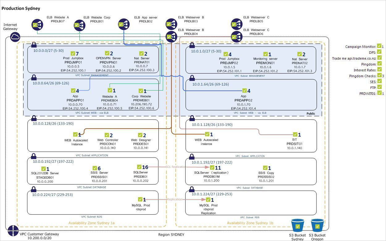
A Dashboard Delivering Electricity
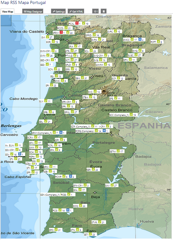
Ricardo Fernandes of REN Serviços, S.A. was our winner in March. His dashboard reminded us of the real-world value monitoring offers. REN operates Portugal's National Transmission Grid (RNT), which ensures a balance between energy supply and demand. If one of the monitored high tension substations isn't working properly, an entire city could be without electricity. Other dashboards enable REN to analyze the problem by checking the primary cores of the Multiprotocol Label Switching (MPLS) network and their interconnections with each other, or help them to monitor the administrative buildings of the company. We liked most how closely Ricardo's dashboard is connected to the company's actual area of operations, which makes monitoring the underlying network structure real easy and approachable.
A Dashboard Packed with Applications
In April system and network engineer Wim Van Haver dazzled us with a dashboard that's not only monitoring 50 locations in 17 countries all over Europe, but also incorporates several other great applications. The most outstanding one is the "wear-a-tie" sensor—yes, that's right: a sensor that's telling Wim and his colleagues if they need to wear a tie! At Sonoco Alcore their boss insists on them wearing a tie if he's in the office, so they came up with an ingenious custom map object based on an ADO sensor, which is linked to the electronic in/out board at the reception desk. So as soon as the little character on top of the dashboard starts wearing a tie, also the members of Wim's IT team can open their drawers and grab their tie.
 Wim Van Haver: Winner in April
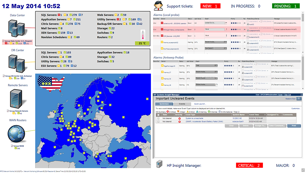
If you want to know more about these great dashboards, just take a look at our "My PRTG Dashboard" winners gallery—also stay tuned for our upcoming blog article on the runner-up dashboards. There's more to discover, so get inspired and start designing your own unique dashboard now!